Movi
PhysicalAn energetic explorer who loves to move.
-
 Celebrate
 -
 Ready
Ready -
 Encourage
UI/UX design · Design system · Character animation
Playivity measures how children aged 3 to 11 move at school. I gave its platform one design system, four animated Pals and its five core screens, ready for its engineers to build.
The problem
Playivity’s wearables and Playposts were already sending live data into a working React app. But the teacher dashboard and the admin area had grown into two different looks, and the interface didn’t feel playful or made for children.
Their engineers needed one source of truth to build from. The children needed something that celebrates moving and never shames sitting still.
The Pals
Each Pal stands for one domain of physical literacy, and each one has three looping states. They turn up where they help: dashboard headers, Let’s Play, the Playpost screen and the assembly summary.
An energetic explorer who loves to move.
Celebrate Ready Encourage A curious thinker who explains and discovers.
 Celebrate
  Ready
Ready  Encourage
 A kind encourager who looks after wellbeing.
 Celebrate
  Ready
Ready  Encourage
 A team motivator who brings everyone together.
 Celebrate
  Ready
Ready  Encourage
 The big moment
“How did we do?” walks the whole class through its week, one big number at a time, with a Pal for each win. Figma can’t play motion, so I also handed over a runnable reference for every entrance, count-up and confetti burst.
Rebuilt here from the delivered design and motion reference, with its demo data.
The system
The dashboard and the admin area now share one set of tokens for colour, type, spacing and radius. Every colour has one job everywhere, so a chart reads the same way on every screen.
Red is reserved for real errors. Sitting still is a calm grey, never a fail. Charts here use the design’s demo data.
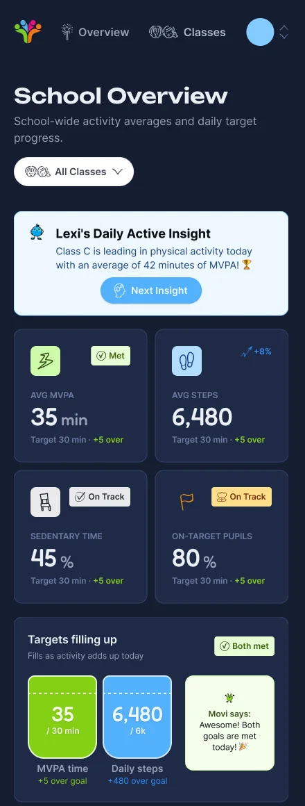
Standard charts became things you get at a glance: buckets that fill up as the day adds up, and thermometers that warm up towards the goal.
Movi says: Awesome! Both goals are met today! 🎉
Fredoka for titles and numbers, big enough to read across a hall. Inter for everything a teacher reads up close.
Generous corners and chunky pills on an 8-point grid.
The screens
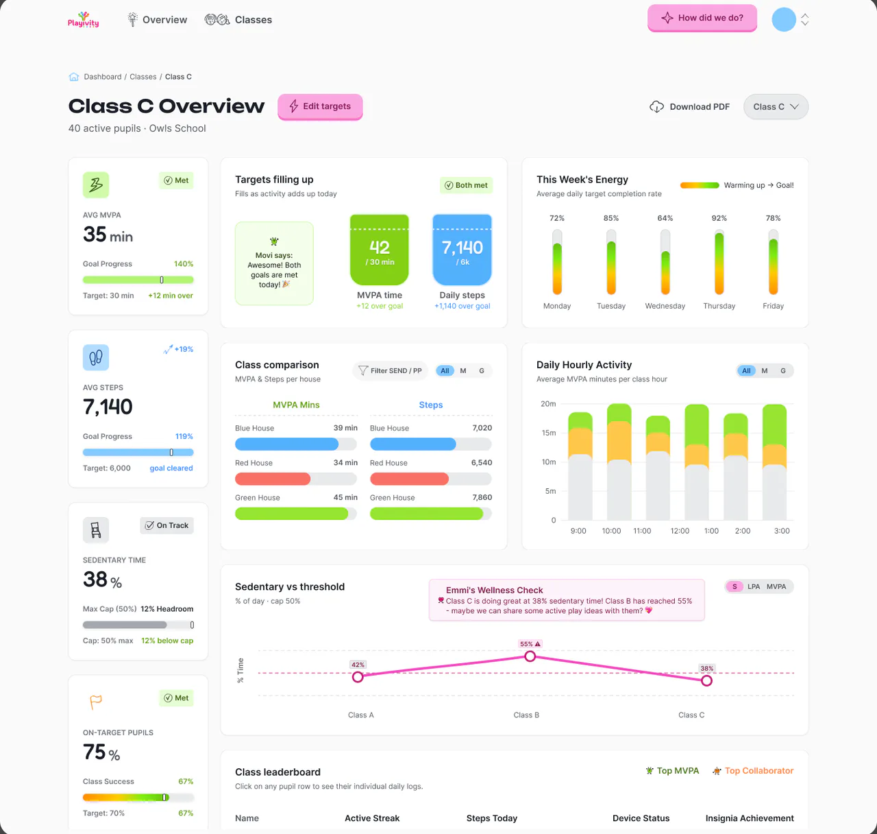
School view, class view, Let’s Play, the 3.5-inch Playpost screen and the “How did we do?” summary, each with its default, hover, active, disabled and empty states, in one clickable Figma prototype.
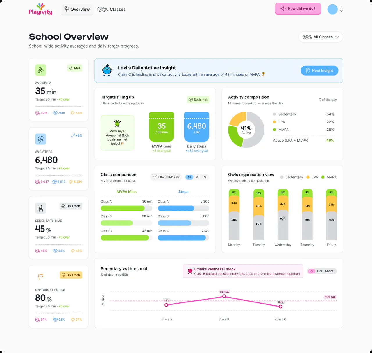
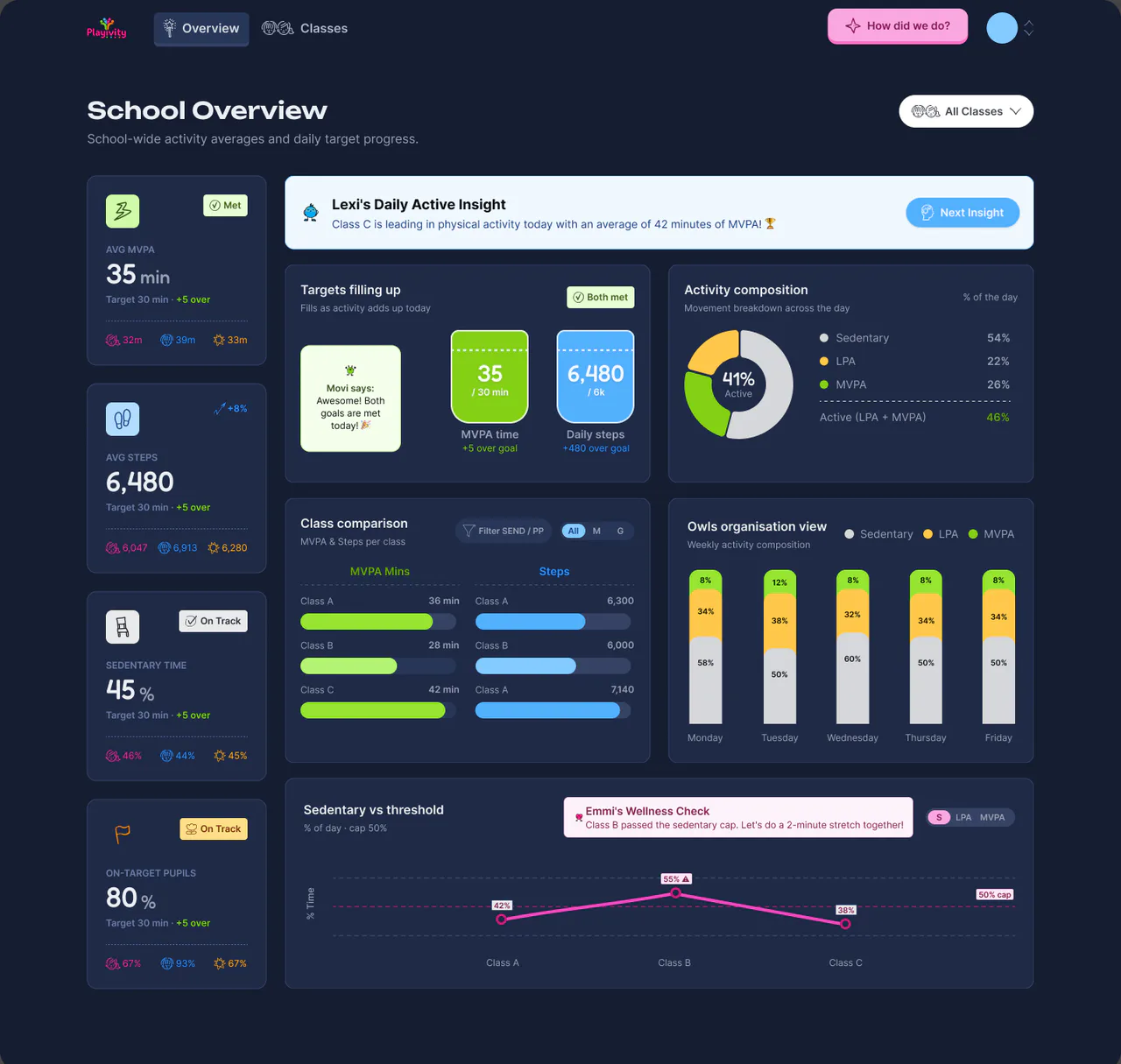
Light for the teacher’s laptop. Dark for the big screen. Same layout, same tokens.
How I built it
Everything lives in one Figma file: tokens, type, icons, components and screens. Their engineers read it in Dev Mode and build it in React, against their Rust and GraphQL backend. My job was to make the calls that keep it consistent.
Delivered.
The design system, the Pals and their 12 loops (shipped as 25 takes to pick from), five high-fidelity surfaces and the handover pack. Playivity’s own team builds it from here, from one source of truth.